.3zgpbexijmmk9.png&w=3840&q=75)
Dignify Studio Site
- Website
- 2026
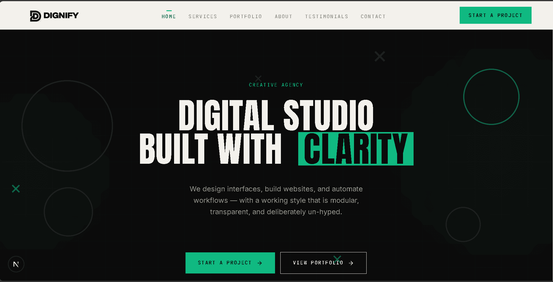
Ini proyek internal pertama kami dan contoh paling jelas cara kami bekerja. Situs ini menggabungkan grid modular, hierarki editorial, aksen yang dibatasi, konten terketik, dan markup yang bisa diakses dalam satu produk yang berfungsi.
Masalahnya.
Studio yang dijalankan tiga orang butuh satu situs yang menjelaskan layanan, membangun kepercayaan, dan menunjukkan kualitas kerjanya. Kami memilih sistem yang disengaja, bukan template agensi generik.
Cara kami membingkainya.
Kami menetapkan aturan visualnya dulu: dua permukaan monokrom, dua aksen, tiga tipografi, dan satu grid. Kontennya hidup di file data terketik, jadi kami bisa memperbarui situsnya tanpa menulis ulang layout.
Yang kami kerjakan.
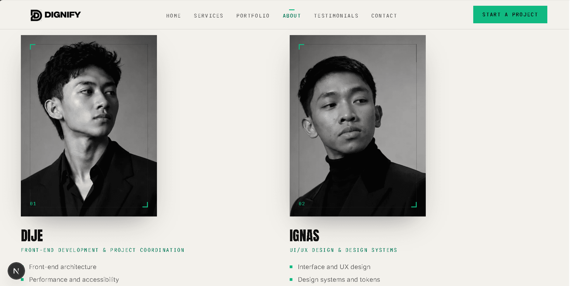
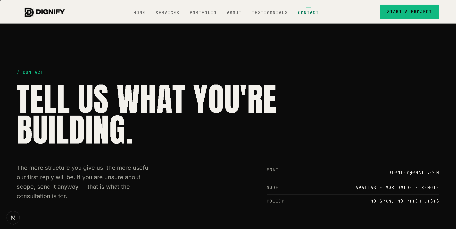
Hasilnya situs dengan tujuh halaman: beranda editorial, layanan yang detail, portfolio yang bisa difilter, studi kasus, halaman tentang, halaman testimoni yang hanya melaporkan apa yang ada, dan formulir kontak. Lembaran visualnya memakai SVG dan geometri, jadi situsnya tidak bergantung pada pustaka gambar yang besar.
Proses pengerjaannya.
- Menetapkan fondasi monokrom, aturan aksen, dan skala tipografi sebelum layout apa pun.
- Mendefinisikan primitif yang bisa dipakai ulang: bagian, garis, tag, tombol, dan perilaku reveal.
- Menulis lapisan konten terketik untuk layanan, proyek, proses, dan nilai sebelum membangun halamannya.
- Membangun rute di server dan menambahkan komponen client hanya di tempat filter, formulir, atau motion membutuhkannya.
- Menjalankan lint, type check, dan build produksi; mengaudit integritas konten dan aksesibilitas.
Lembaran sistem.
STACK YANG DIPAKAI
Refleksi
Membangun situs sendiri memperjelas proses kami. Tim kecil bergerak lebih cepat saat aturan visual dan struktur kontennya dituliskan. Kami juga menjaga klaimnya tetap dekat dengan pekerjaan yang benar-benar kami lakukan.
Pekerjaan yang dibuat untuk dan oleh studio Dignify sendiri.